


ABOUT
One of the largest law firms in Latin America, Mattos Filho recognized the importance of staying at the forefront of innovations in the legal industry. To set a new standard in this traditional industry, Mattos Filho created Attix: a hub connecting legaltechs interested in scaling their impact with proposals to transform society and businesses to clients who want more innovation and efficiency in their legal processes. We developed the expression of this new brand, working on strategy, visual identity, and key messages.
SOBRE
Um dos maiores escritórios de advocacia da América Latina, Mattos Filho reconheceu a importância de estar à frente das inovações no setor jurídico. Para estabelecer um novo padrão nessa indústria tradicional, Mattos Filho criou Attix: um hub que conecta legaltechs interessadas em escalar seu impacto com propostas para transformar a sociedade e os negócios, a clientes que querem mais inovações e eficiência nos processos jurídicos. Desenvolvemos a expressão dessa nova marca, trabalhando na estratégia, identidade visual e mensagens-chave.

THE LOGO
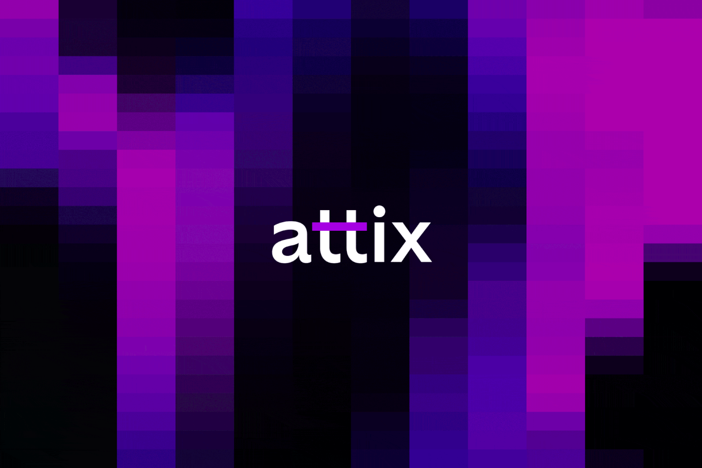
Since Attix is an initiative born from Mattos Filho but with a distinct role from the parent brand, we understood that the logo should reflect this relationship of proximity and distance.
To highlight the similarities, we used the same approach of emphasizing a part of the logo, highlighting the bar that connects the two Ts in Attix. We also borrowed the purple color from Mattos Filho, modifying it to a brighter shade to create a stronger connection with the codes of the technology universe.
To emphasize the differences, we designed the logo with lowercase letters and removed the primary color of the parent brand, orange, from the visual universe of Attix. The upward-pointing arrow, which symbolizes Mattos Filho's pursuit of excellence in the legal sector, becomes a horizontal bar in Attix, representing the brand's calling to connect with companies and legaltechs and expand the frontiers of legal innovation.
In addition to the main version, we have also created variations endorsed by Mattos Filho, used in applications and contexts where the relationship between both brands needs to be reinforced.
O LOGO
Uma vez que Attix é uma iniciativa nascida de Mattos Filho, mas com uma atuação distinta da marca mãe, entendemos que o logo deveria traduzir essa relação de proximidade e distância.
De semelhanças, utilizamos a mesma abordagem de dar destaque para parte do logo, evidenciando a barra que conecta os dois Ts em Attix. Nos apropriamos também do roxo de Mattos Filho, modificando-o para um tom mais aceso, com o objetivo de trazer uma conexão maior com os códigos do universo das novas tecnologias.
Para evidenciar as diferenças, desenhamos o logotipo com letras em caixa baixa e retiramos o laranja, cor principal da marca mãe, do universo visual de Attix. A seta apontada para cima, que em Mattos Filho simboliza a busca da empresa pela excelência no setor jurídico, vira em Attix uma barra horizontal, representando a vocação da marca em se conectar com empresas e legaltechs e expandir as fronteiras das inovações jurídicas.
Além da versão principal, criamos também variações com o endosso do Mattos Filho, usadas em aplicações e contextos onde a relação entre as marcas precisa ser reforçada.
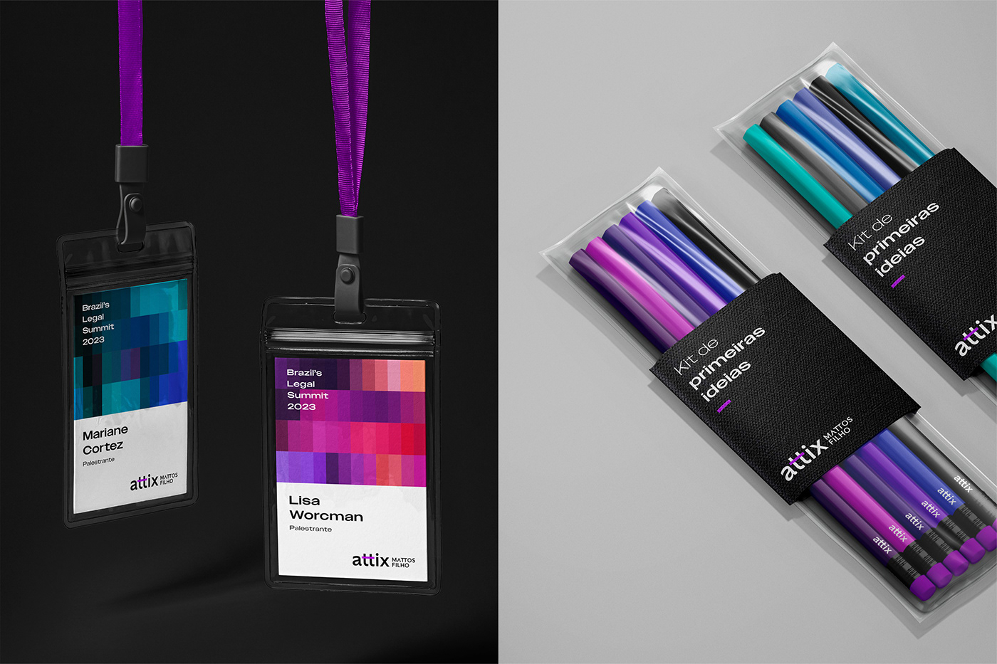
GEOMETRIC MESH
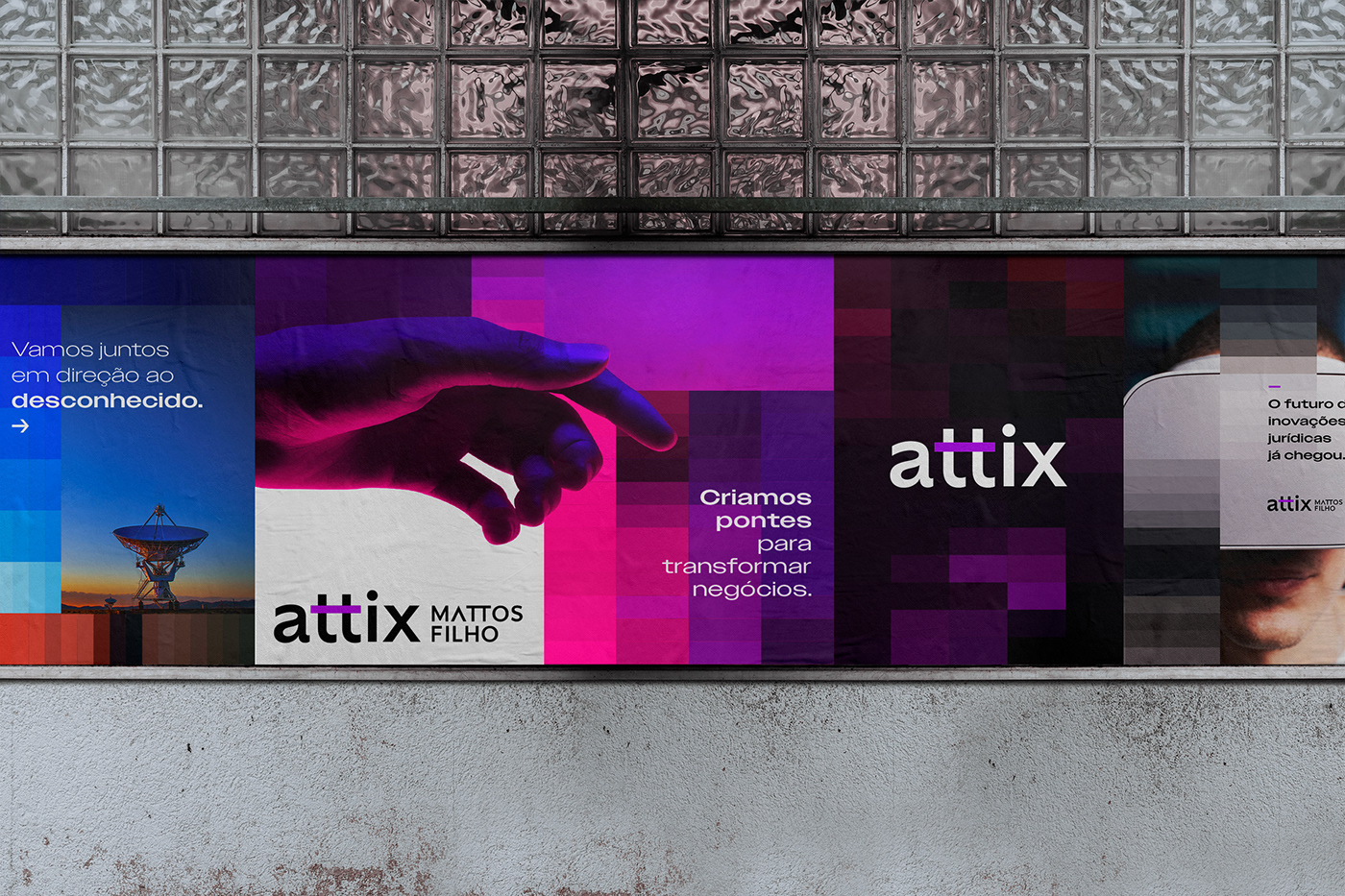
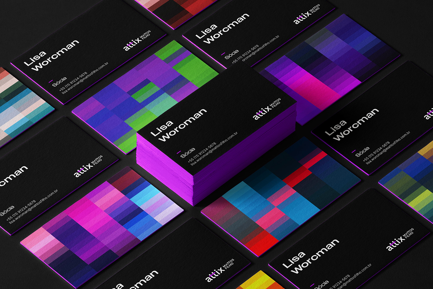
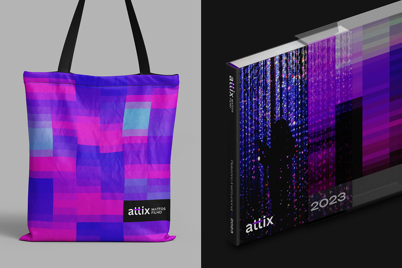
Inspired by the pixel language of digital interfaces and the text lines of programming codes, we developed a visual identity based on geometric meshes formed by bars. Fueled by images and generated by the computer, we use these meshes as a grid, guiding the composition of texts, images, and other graphic elements.
MALHA GEOMÉTRICA
Inspirado pela linguagem de pixels das interfaces digitais e pelas linhas de texto dos códigos de programação, desenvolvemos uma identidade visual que têm como base malhas geométricas formados por barras. Alimentados por imagens e gerados pelo computador, utilizamos essas malhas como um grid, pautando a composição de textos, imagens e outros elementos gráficos.

PHOTOGRAPHY
The photographic style is colorful and high-contrast. The images seek to portray the complex themes communicated by Attix, such as innovation and artificial intelligence, through abstract representations and photographs of new technologies.
FOTOGRAFIA
O estilo fotográfico é colorido e com alto contraste. As imagens buscam retratar os temas complexos comunicados por Attix, como inovação e inteligência artificial, por meio de representações abstratas e fotografias de novas tecnologias.
COLORS
The colored bars formed by the meshes add to the base colors of the identity, bringing dynamism and unusual color combinations to the compositions. We maintain the shades of purple, gray, black, and white as the main colors, but we open up the freedom to interact with other colors.
CORES
As barras coloridas formadas pelas malhas se somam às cores-base da identidade, trazendo dinamismo e combinações de cores inusitadas para as composições. Mantemos os tons de roxo, cinzas, preto e branco como cores principais, mas abrimos a liberdade para a interação com outras cores.

TYPOGRAPHY
The Owners XWide typeface was chosen for headlines because of its wide characters and formal connection to the logo and the format of the bars formed by the geometric meshes. The Inter typeface was chosen for body text because it is a versatile and widely used typeface for digital devices.
TIPOGRAFIA
A tipografia para chamadas, Owners XWide, foi escolhida por ter caracteres largos e fazer uma conexão formal com o logo e o formato das barras formadas pelas malhas geométricas. Já a Inter foi escolhida para textos corridos por ser uma tipografia livre e de referência para dispositivos digitais.
ANIMATIONS
We explored the full potential of the geometric meshes in the animations, incorporating videos as well as images. The movement is achieved through both animating the geometric mesh by modifying the number of rows and columns over time, and by moving the figures behind the mesh. For the animation of texts and other elements, we sought to use movements that combine high speed with easing, to evoke a sense of a dynamic but decodable future.
ANIMAÇÕES
Exploramos o máximo potencial das malhas geométricas nas animações, incorporando além de imagens, vídeos como insumo. O movimento é criado tanto pela animação da malha geométrica, com a modificação da quantidade de linhas e colunas ao longo do tempo, quanto pelo deslocamento das figuras por trás da malha. Para a animação de textos e demais elementos, buscamos utilizar movimentos que combinam alta velocidade com suavização, para evocar uma sensação de um futuro dinâmico mas possível de ser decodificado.
CREDITS / CRÉDITOS:
Strategic Direction / Direção Estratégica: Anne Grecco
Strategy / Estratégia: Cristiane Scaff, Bianca Daccache, Isabel Mossato
Creative Direction / Direção Criativa: Gil Bottari
Creative Coordination / Coordenação Criativa: Laila Rotter
Visual Identity / Identidade Visual: Diogo Aso, Gabriel Deda
Motion design: Diogo Aso
Copywriting / Redação: Jéssica Naveira
Interbrand Brasil


